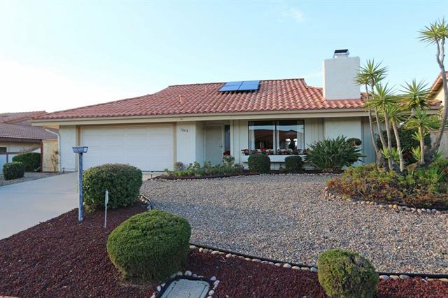
Since we sold the last house that I remodeled, I couldn’t wait to do another one. And lucky for me, the wait wasn’t too long. We closed escrow on a house on March 31, so I am flipping a house again! It’s really something I enjoy, so I am pretty excited to do another one. This one isn’t half as bad as the first one, it just needs updating and some tweaks to the layout. The remodel is actually already half way done, I am just a little late getting posts together to share the progress. It’s a two bedroom 2 bath home in a over 55 community. Pretty much every house in the neighborhood has a rock scape yard. Here is the house we bought to flip
I must admit, the over 55 is scarring me design wise. It’s a community that is very traditional in design style, and there seems to be a lot older than 55 who live in this community. But I am hoping that potential buyers will be more on the younger side of 55, and not traditional. It’s a risk, and I hope I it pays off.
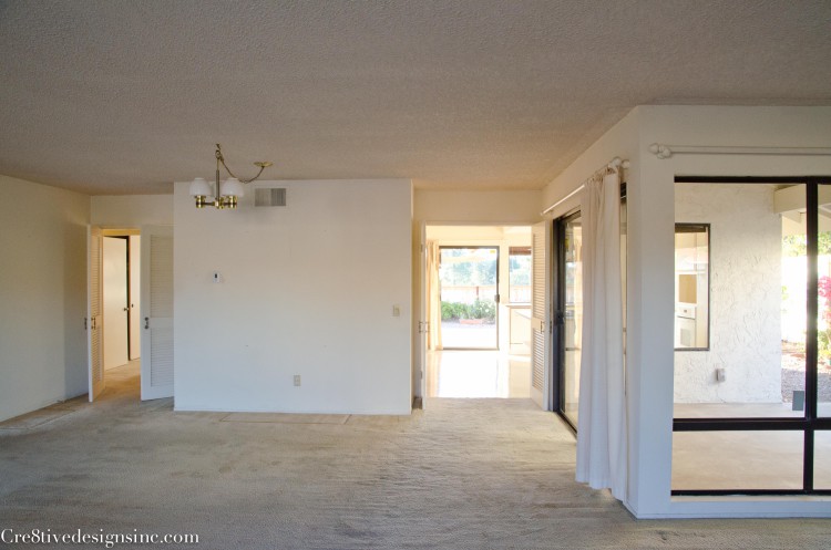
The layout of the house was a little strange. When you walked in, you saw two entries to the hallway with doors, with an odd wall as the divider
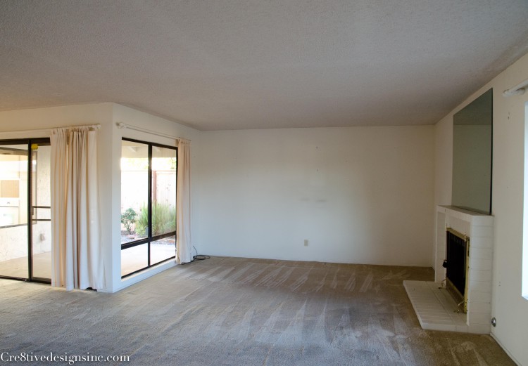
Across from that wall you can see a sliding glass door that leads to a small side patio. A patio that has no view, and no real purpose. It is smack in between the kitchen and living room. And each wall had a window, one into the living room as you can see here
And the other one in the kitchen, {the window is on the right in this picture}
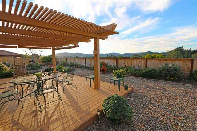
The backyard has a beautiful view and it’s own patio. So having that odd side patio just made no sense. Plus the window took up valuable wall space in the kitchen
Here is the layout to help you get a better visual. I put arrows to help you see the two entries to the hallway and the side patio in between the kitchen and living room. The green area is the entrance

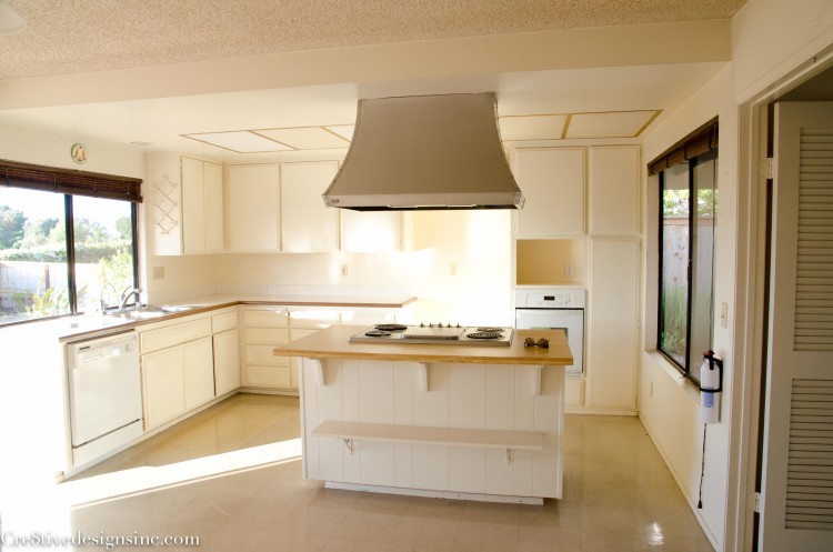
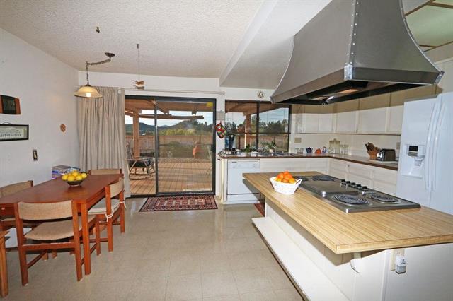
Speaking of the kitchen, as you can see, it was in need of a major overhaul. Here is a picture from the listing. It had this huge hood over the island, and a soffit which made the room feel like a cave. The layout had the refrigerator centered behind the hood, as if it was a focal point in the room. It was all just wrong.
This house was too choppy and wasn’t taking advantage of the beautiful view. First thing we did was take off the popcorn ceilings. Then we took out the weird wall, drywalled in one opening and made one large entrance to the kitchen and hallway.
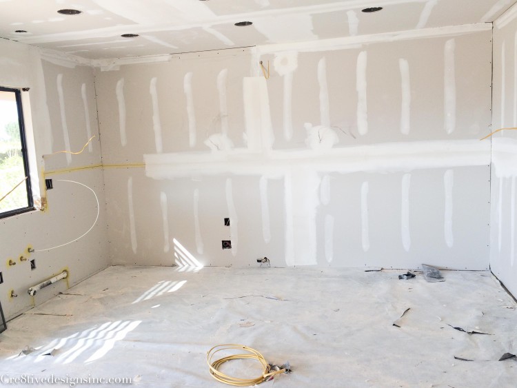
Feels much more open already! Then we gutted whole kitchen. We took out the window and put drywall up so that the refrigerator could be placed on that wall. I moved the range top from the island to where the refrigerator was. Now the island will be a large area for prepping. Not that you can tell any of this from this picture lol
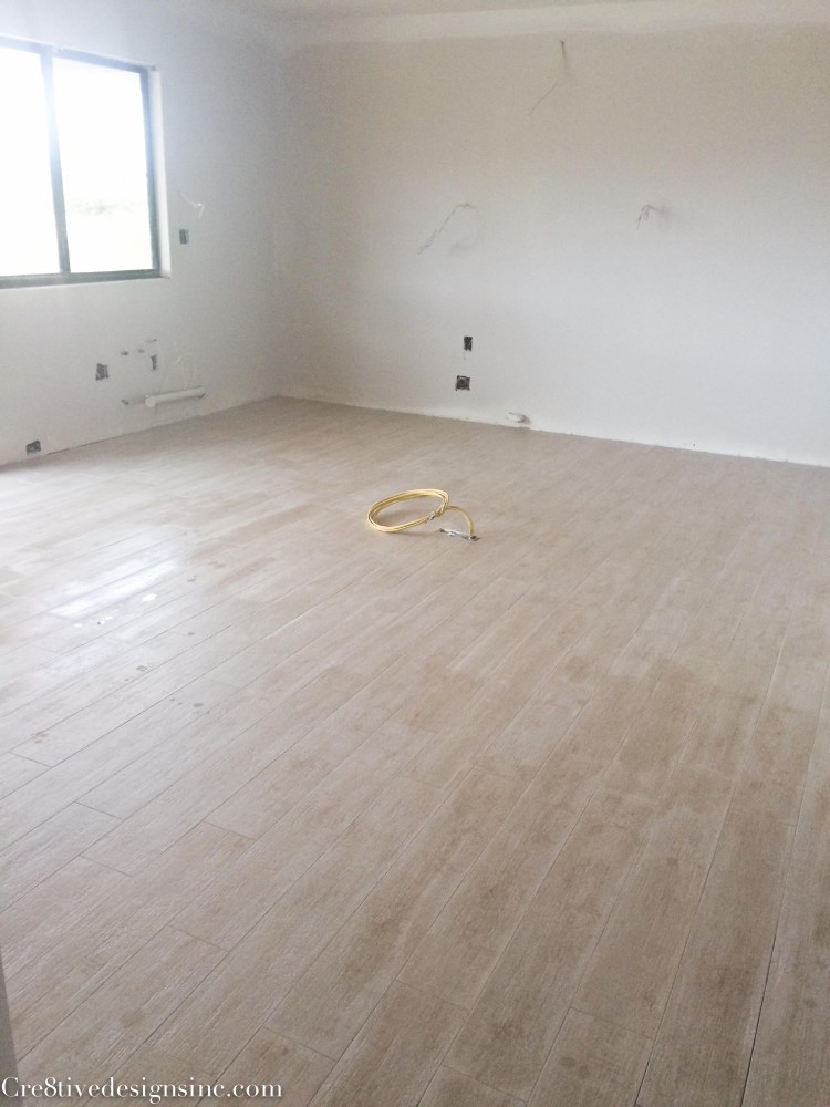
The flooring had to go in before the cabinets. Well, some people don’t do that but I do. I decided to do porcelain wood plank flooring throughout the house except in the bedrooms. I went with a light color, which I was hesitant about, but the price point at $4.18 square foot was too good to pass up. And you know what? I love it! I might even like it better than hardwood floors. You never have to worry about the scratches you get with wood floors. It’s great for people who have dogs and kids. Even though the people who buy this house won’t have kids, but maybe grandkids. It takes a beating better than hardwood, yet still gives you the same look.
My inspiration for the kitchen is to do white cabinets and a dark island and light floors.
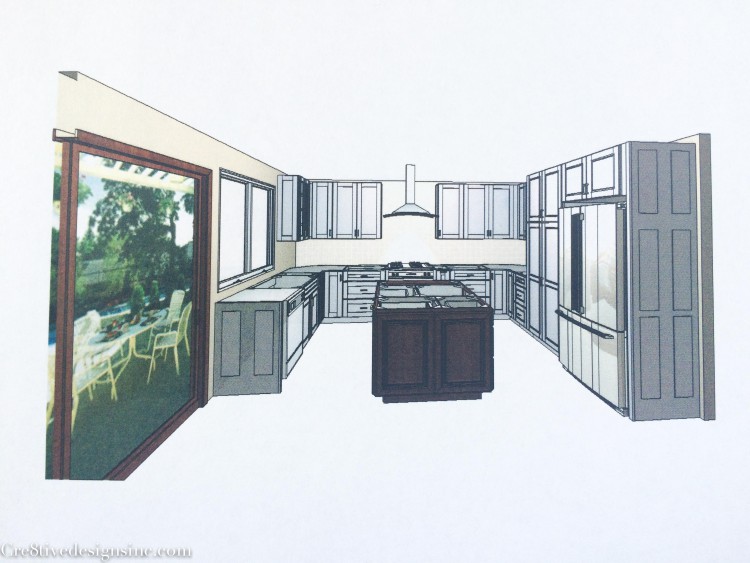
Since we just got a Lowe’s down the street {woohoo} I ordered all the cabinets from them. It is my first time ordering semi-custom cabinets from Lowes and I must say, I am impressed with their prices. It wasn’t as inexpensive as the Ikea kitchen I did in the last house, but a lot less than I thought it would be. I want to do a post about price comparasion once this house is done. I think that is really helpful to people when they are doing their budget for their own kitchen remodel. This is the new layout of the kitchen
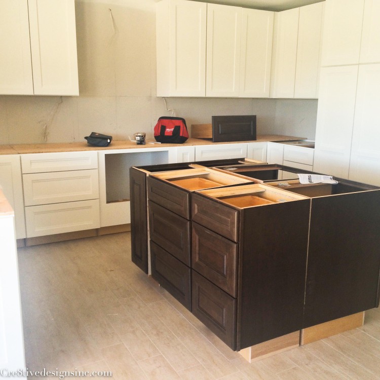
See how much more room there is now with that window on the right gone? And the focal point is the hood rather than a big ole refrigerator. The kitchen is moving right along. Cabinets are already being installed, this picture was taken about a week ago
The BIGGEST hurdle I have come across doing this remodel is that damn side patio. I plan on making it into an office. Makes more sense than a patio, plus it adds square footage to the house, which adds value. But it has become a thorn in my side. It has to be permitted, and going through the process is taking for ever and the requirements and standards they are imposing are just ridiculous. Not to mention just the fees alone are $1500. And that is before I even start the construction. And! we are only talking adding 92 square feet. I am not a happy camper to say the least. But I am still moving forward with it, because the end justifies the means, I just don’t know how much hair I will have left once it gets approval 🙂
If you follow me on Instagram {cre8tivedesigns}, you can see more of the house progress in real time. I will be back soon to show you more of the remodel, and hopefully will be showing you the makings of a patio turned into an office. Hopefully…






Thanks so much for this post! My wife and I have been considering flipping a home, and your posts (like this one) are an inspiration that IT IS POSSIBLE! I thought your decision to turn the patio into a home office was interesting and I’ll be interested to see the finished product. Hope things work out! Good luck!
Hi. I really enjoy your posts. What wood tile is this, I love the Color? Thank you,
Jennifer
Hi Jennifer, I don’t know the color of the wood tile. We had originally picked a color called tumbleweed but it was discontinued. So we went with something similar and the color wasn’t specified. Sorry about that.