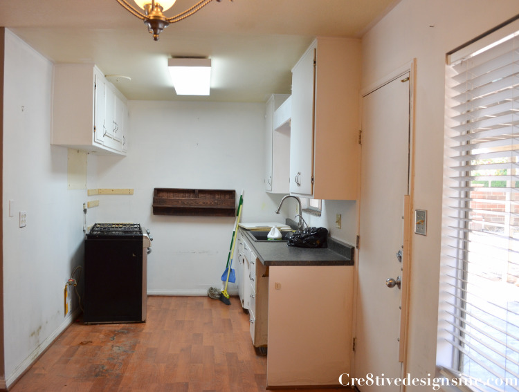
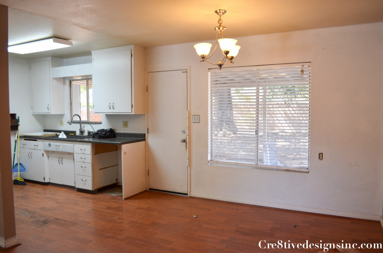
The rental house remodel is coming along. I wish it was on the market already, but construction always takes longer than you think, with a lot of bumps in the road that you can’t for see. Right now I am having the whole house painted again. The first painter, who I had never used before did such a crappy job that I finally had to bring in my regular painter to fix it. Lesson learned. Go with who you know, and wait if you have to. Today I want to show you the kitchen, or should I say lack of a kitchen
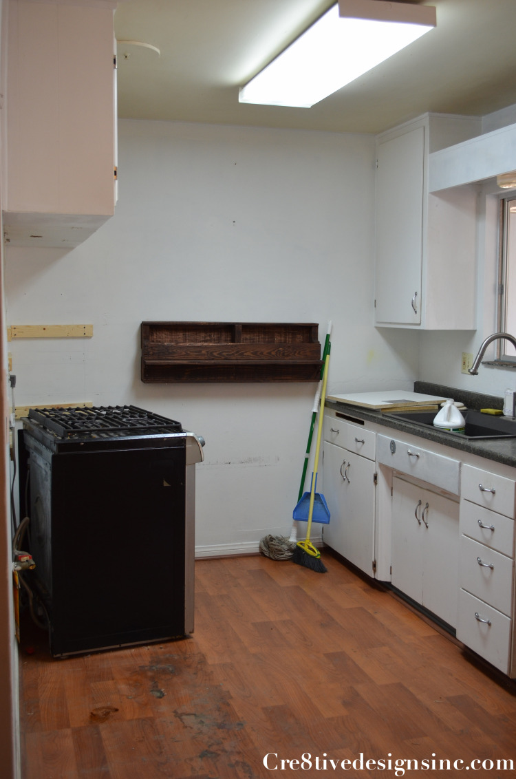
Complete with a range that didn’t even work. I’ve never seen such a dysfunctional kitchen. No counter space, no cupboard space, it was a mess.
This kitchen needed more space and I needed to come up with a plan to remedy it.
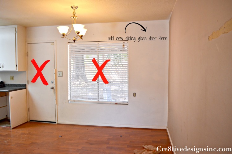
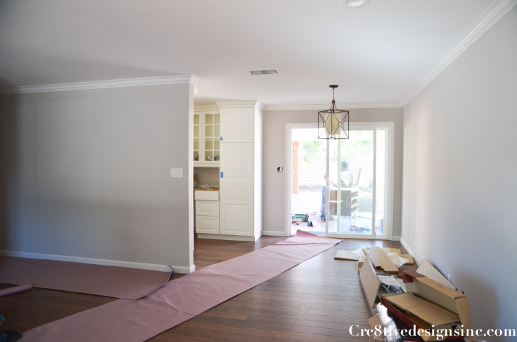
And I found the perfect solution. Get rid of the door and window and add a sliding glass door. That freed up a lot of wall space, let in more light and still gave access to the backyard
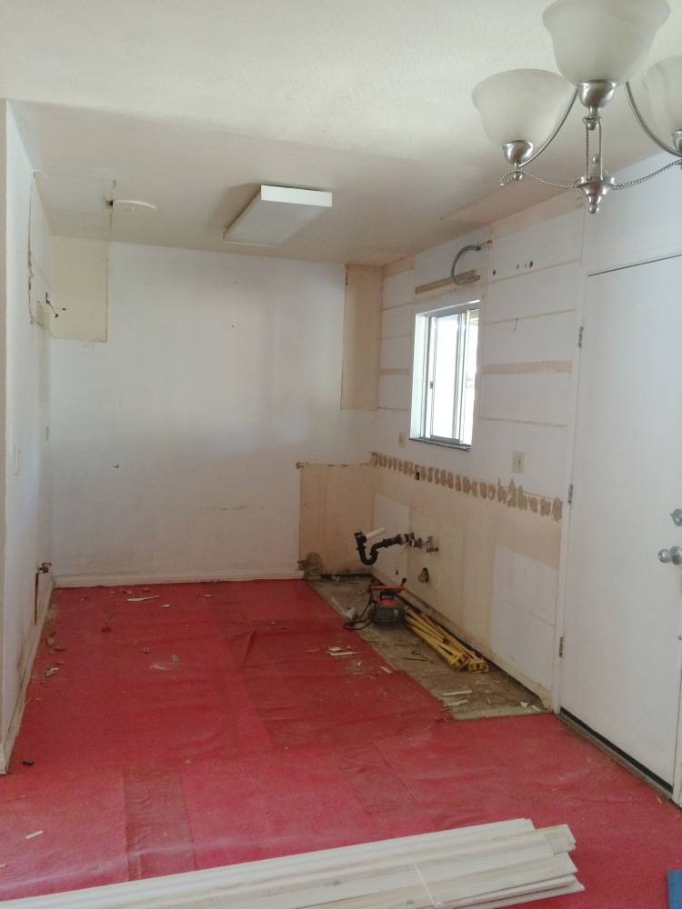
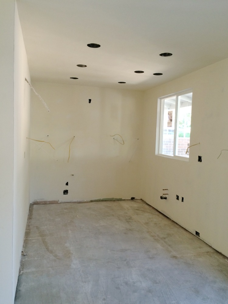
Now that we had a plan we started gutting the kitchen
I don’t have a picture of it, but we also took most of the drywall out to fix the electrical which was so boot legged it was a fire hazard. I did a new appliance, electrical and cabinet layout, and the subs got to work. We were replacing all the windows in the house, so I made the sink window larger to accommodate my new layout.
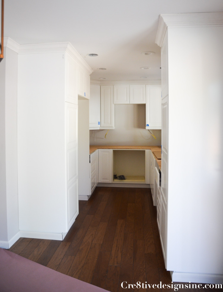
Now as you can see this kitchen IS NOT big. Even with the new addition of kitchen space I was able to give it, it is still tiny. But just because a kitchen is tiny, doesn’t mean it can’t be functional. Since we had to replace ALL the plumbing and electrical which was a huge cost, I had to get creative on the kitchen budget. I have always loved the space saving functionality of Ikea kitchens, I used them in my daughter’s kitchen remodel and loved them. So it was a no brainer to use them in this kitchen. I used their 3-D planner and had the cabinets delivered. The ordering and layout of the Ikea cabinets did not go as smooth as when I did my daughter’s kitchen. Let’s just say patiences and triple checking is the key when you do an Ikea kitchen. I moved the stove to the back wall and extended the cabinets into the space where the door and window were
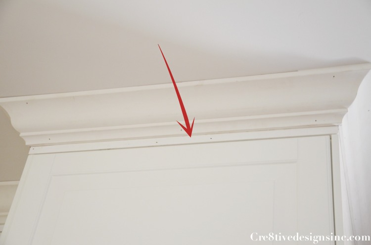
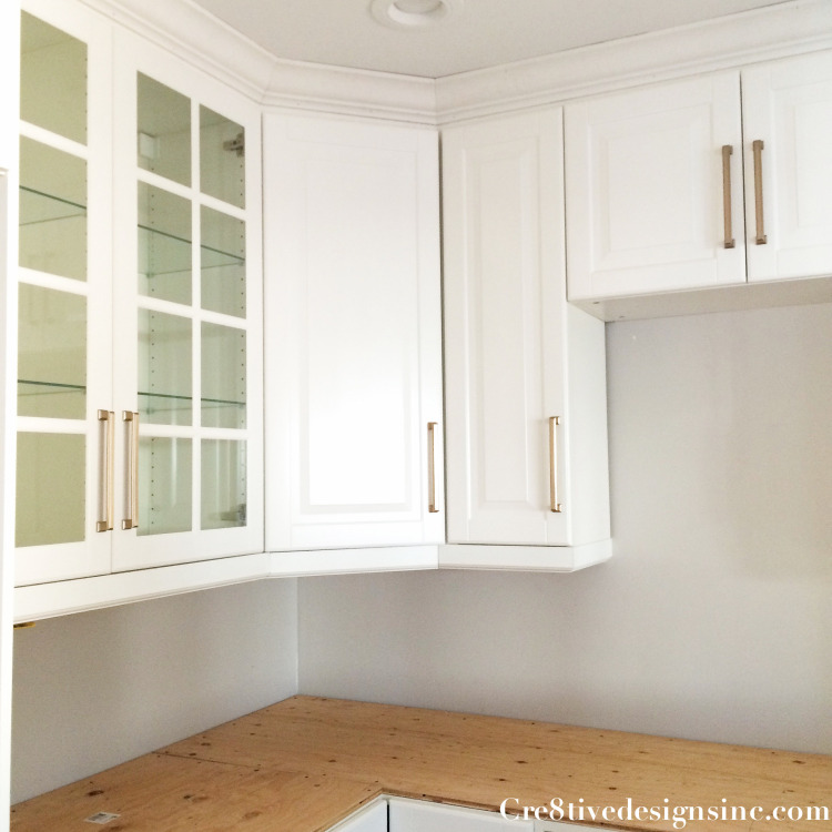
Being that this kitchen is narrow, I used two sets of glass uppers so it wouldn’t feel too claustrophobic. The plan was to hang the uppers down 3″ from the ceiling so we could continue the crown molding around the perimeter of the kitchen, giving it more of a custom look. But the cabinet installer hung them at 4″ instead of 3″, so we had to improvise and add a flat lip to the top of the cabinet and then run the crown molding above that. Irritating that this had to be done, but luckily when it is all painted it will look good.
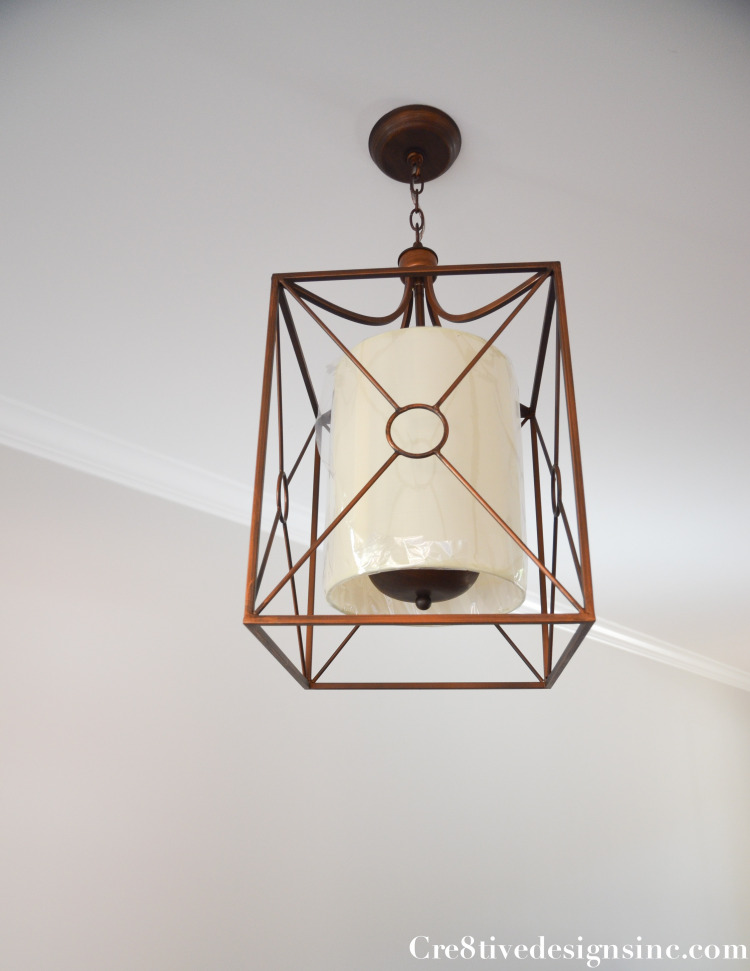
The light fixture in the dining area I ordered from Overstock.com, $109 {of course your suppose take the plastic off the shade, but for now I left it on until all the construction is done} It is called the Josie Antique Copper Iron Chandelier
I did something I haven’t done before. I used pulls for the upper cabinets. I love how it looks. The finish on the hardware is champagne bronze which will match the sink faucet and ties in nicely with the light fixture. We are waiting on the countertops to be fabricated, and then the appliances will go in.
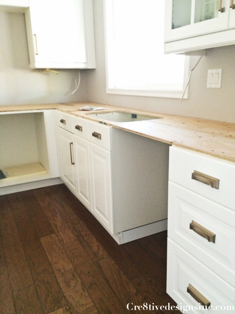
On the bottom cabinets I used matching cup pulls {sorry I only have a progress picture using my iphone} I put the cup pulls on the sink fixed drawers, I am on the fence on whether I should of done this or not. I guess I will see after the kitchen is done how it looks. It would be a hard fix if I don’t like it, so I am hoping it will look good.
When I look at this before picture of the sad little kitchen and adjoining wall
And then the after of taking out the door and window and adding the sliding glass door, I think it looks pretty amazing. I have to admit, out of all the aspects of being an interior designer, my absolute favorite is over coming challenges like I did in this kitchen remodel. Putting together a pretty room is the fun part of design, but I’d rather do this type of design any day. I love a challenge and envisioning the best use of a space.
Next up on the remodel I will show you how I took the front of the house from one dimensional and boring and gave it some style.
In case you missed them, and want to see more, here are the previous rooms in the rental house remodel series







You should have your own show on HGTV. 🙂
Great job on the kitchen–why is it nothing ever just goes the way it should? (the 3-4″ on the cabinet installation)
You’re so smart, you really can do it all.
gail
Where did you get the pulls for the upper and lower cabinets? It’s a gorgeous remodel. Looking for something just like these for my own!
The pulls are from Atlas Hardware, style is Sutton Place, in a 7″ champagne bronze color.
What are the dimensions of your kitchen? I’m planning a similar layout.
The kitchen was 8″ wide by 12′ long.
Your kitchen looks great! What paint color and finish did you use for the crown moulding?
Honestly, I wish I could tell you, but I can’t remember the exact color…I know I used a color that matched the Ikea cabinets.