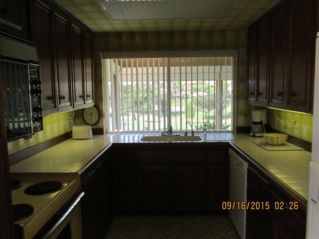
This 70’s kitchen was desperate to come alive and open up to the rest of the house. It was a no brainer that this kitchen needed a remodel. See, back in the 70’s when this house was built, the trend was to make every room separate from each other. The style was to have lots of walls with doorways to designate each room. And this house was no different {picture from the listing}
For the size of the house, about 1800 square feet, this kitchen was dinky comparatively to the rest of the house. It was a galley kitchen that was dark with very little room to move around
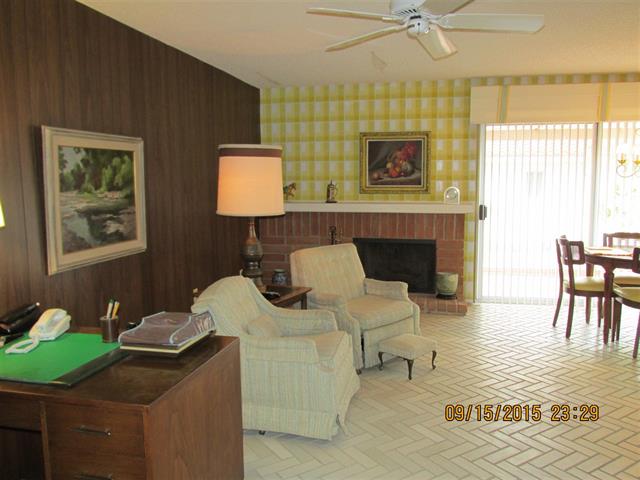
It had two entrances to the kitchen. This door from the formal dining room
And a door from the kitchen nook/den area {you can’t really see it in this picture, but it is right past the slider}
I wasn’t kidding when I said in my last post that this house had a ton of wallpaper. At first I thought the herringbone flooring that was throughout the house was actual tile, and I was determined to save it… but it turned out to be vinyl. That was a good laugh in the midst of the demo.
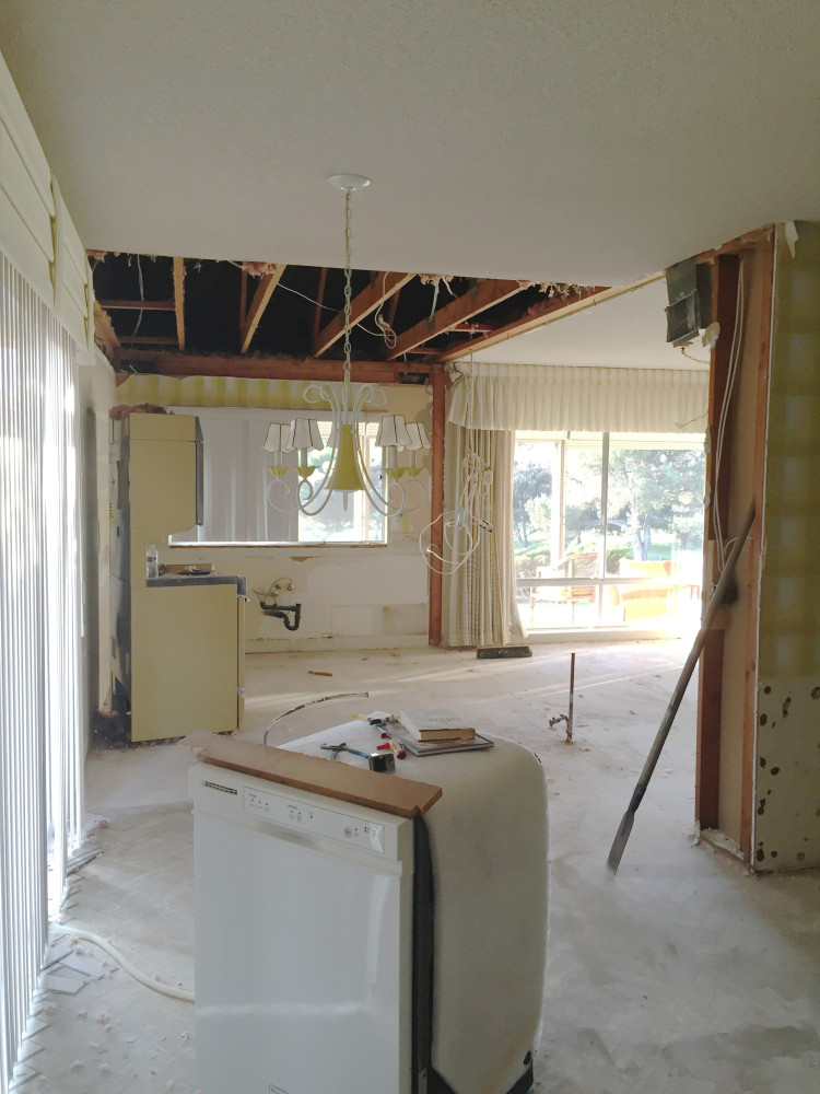
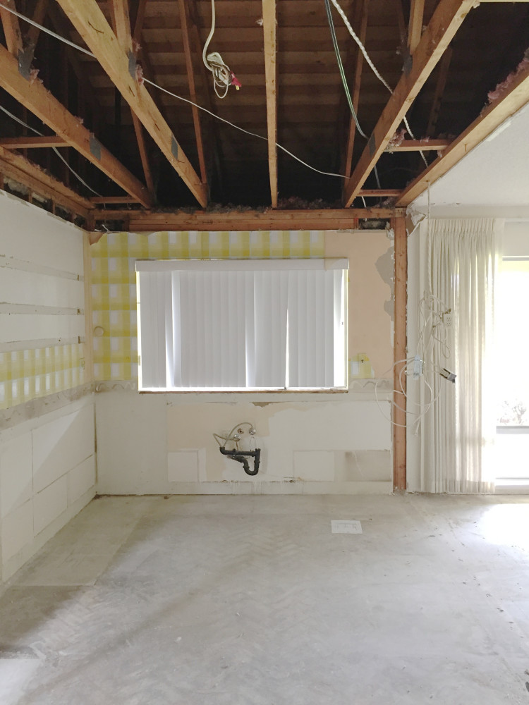
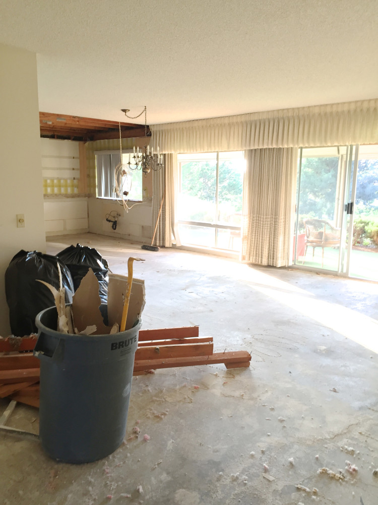
We took the dropped soffit out and gutted the kitchen. The wall and door in between the dining room and kitchen is now gone
So much better already
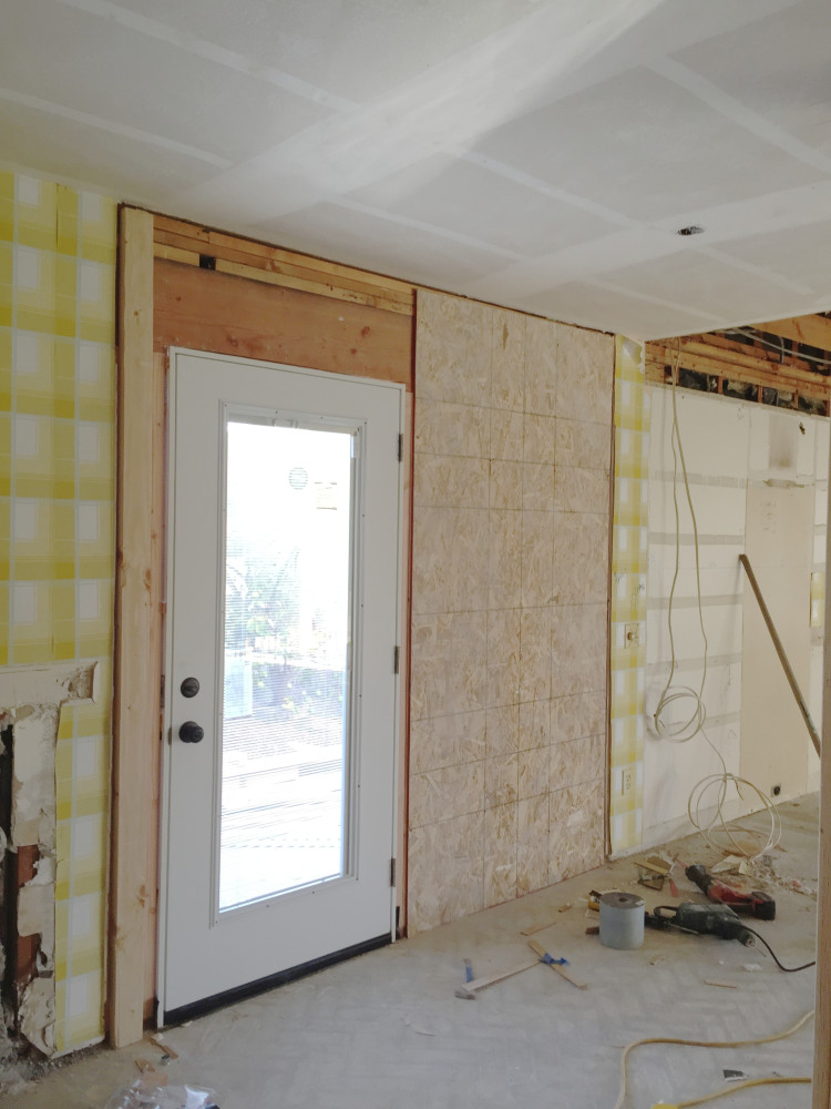
After all the walls were removed I was able to design a bigger more open kitchen. But the one thing that was getting in my way was the slider. It really made no sense to have a slider, since it just went to a small side yard that looks into the neighbor’s house. So I took that out and put in a door with a glass panel for natural light. Oh, and it has built in shades in-between the glass. Never thought I’d buy one of those type of doors, but you know what? They are REALLY cool. Now I want one of my own.
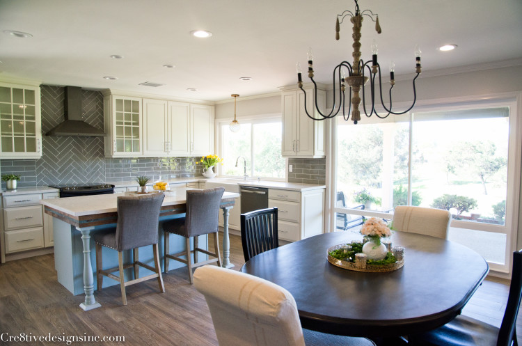
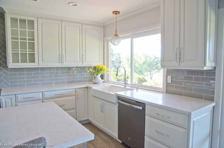
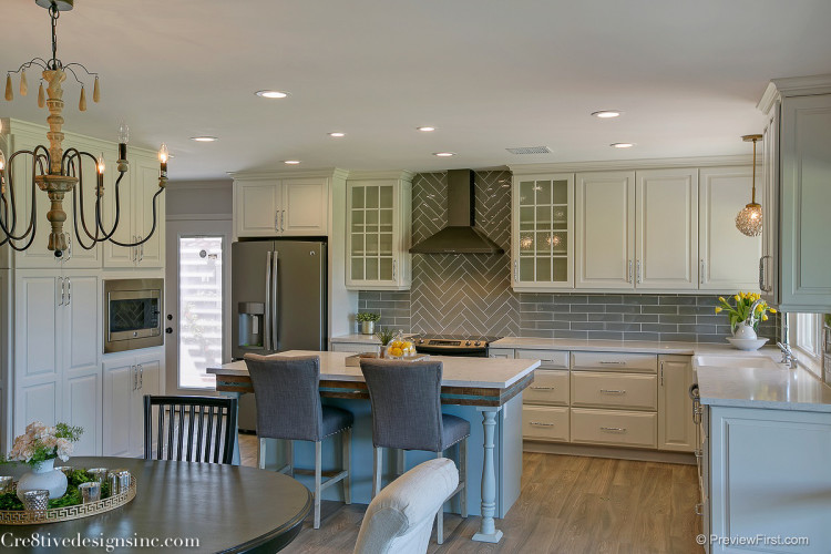
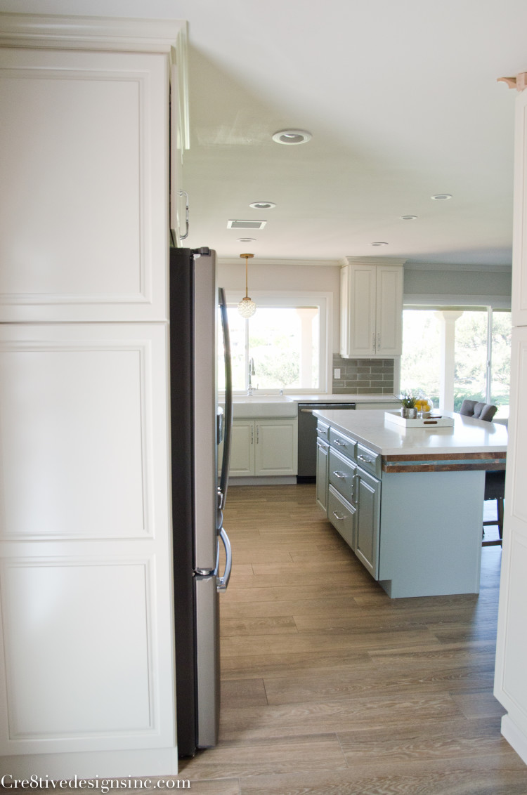
With that slider gone, I had a lot more room to work with to give this the kitchen the space it deserved. And this is how it looks now
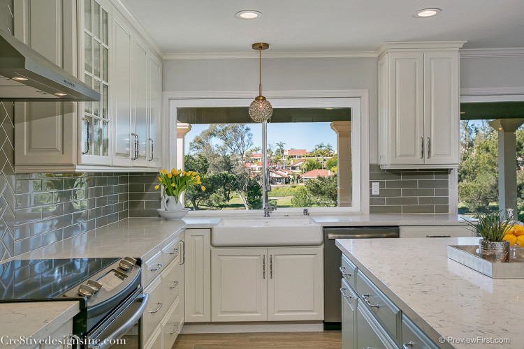
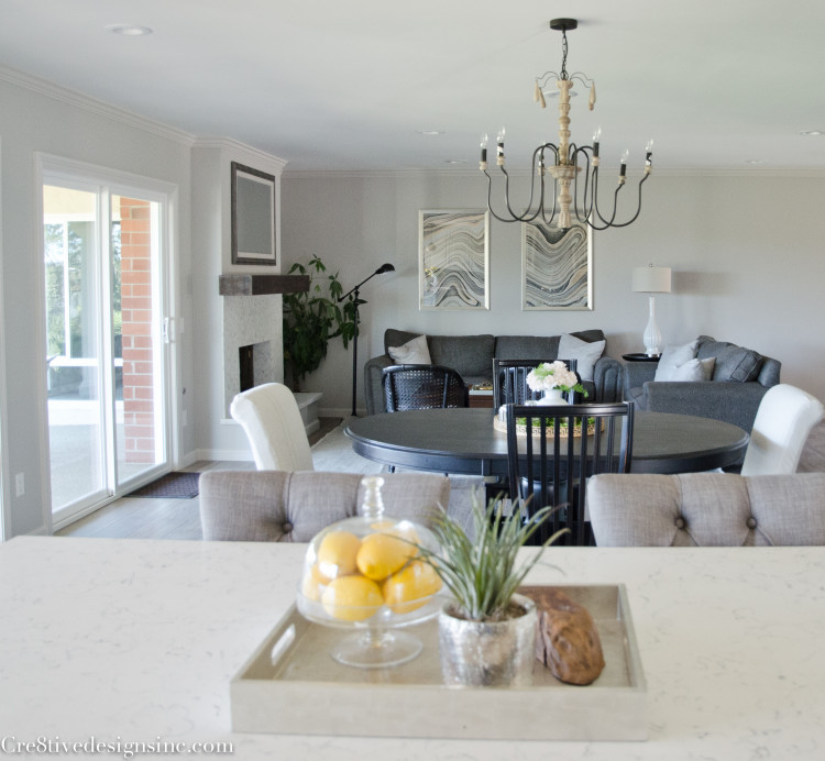
The dining room stayed in the same general area, but gone is the wall that cut it off from the kitchen. I was also able to fit an island in, which makes up for the kitchenette area that I took out. The grey glass tile backsplash reflects the light coming from the windows that were blocked by the wall. It just feels so light and airy now compared to the dark galley kitchen it had before.
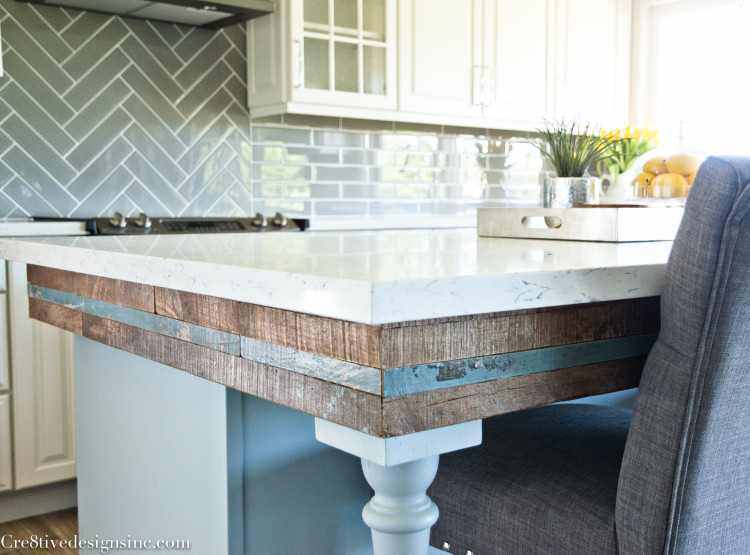
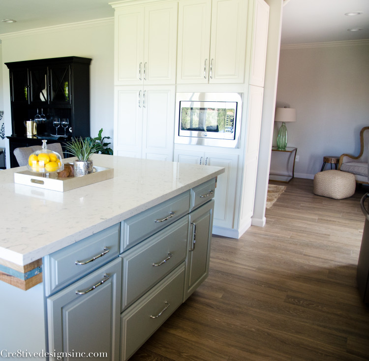
Speaking of the island. I took a risk, and used reclaimed wood around the apron of the island
I didn’t now if potential buyers would like it, but I just thought it gave the traditional look of the kitchen a touch of rustic. I also painted the island a different color than the main cabinets. It was suppose to be a tad bit more grayer, but in the end I liked it.
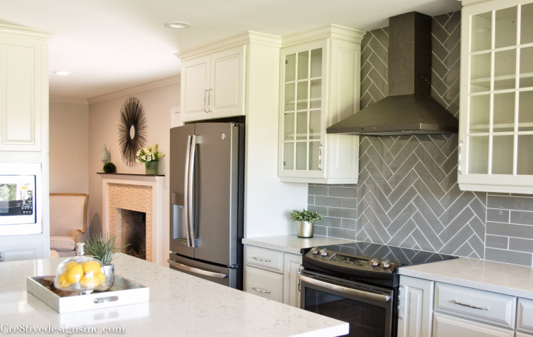
I went with GE Profile appliances. It was their new slate color that got me. It’s not so in your face as stainless steel can be.
The golf course view from the farmhouse sink is gorgeous. It makes doing dishes a little bit more enjoyable
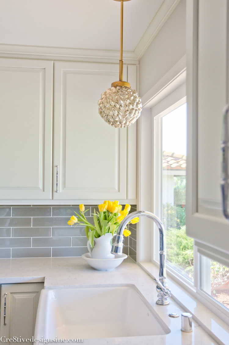
I just love the light over the sink. It is from Lulu & Georgia.
I wasn’t able to get the microwave in the slate color due to the size of the trim kit I needed. So I had to go with stainless steel. It is built-in to the pantry cabinets. That opening you see to the right is the den, or I guess you could say family room. I’ll share that room in another post.
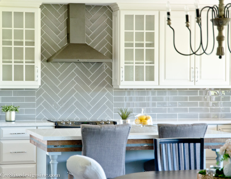
I added a little pizzazz to the stove area and did the glass tile in a herringbone pattern. It is an inexpensive way to dress up your backsplash
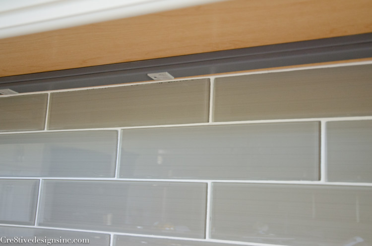
Did you notice that there isn’t what I call “plug acne” in the backsplash? That is because I always use under cabinet plugs instead. I hate the way wall plugs can mess up the look of the tile.
Remember in the beginning I showed you the dark galley kitchen from this view? It’s amazing how much bright and open it feels now
And this is the view standing behind the new kitchen island
You just never know if potential buyers will be on board with your design choices, and this time it paid off. The house sold in 4 days! It is humbling and exciting at the same time. The new buyers loved everything about the house, and there is even a cash backup offer if this buyer falls through. It is such a relief and a little surreal that it has sold already. No complaints here, especially since I already have another big project started.
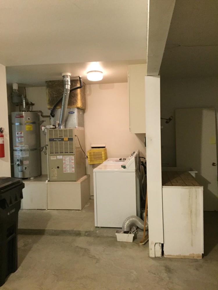
On my next post, I will show you how I took this sorry state of a laundry area
And transformed it into a real laundry room. If you follow me on Instagram, {cre8tivedesigns} you already know by the numerous pictures I posted during the progress, that it is by FAR, my favorite room in the whole house. You’re going to love it!









Wow, wow, wow! The kitchen is gorgeous! And putting the plugs under the cabinets is genius! Kicking myself for not thinking about that when we built our house.
You did such a great job! I love it. I need one of those back doors with the blinds. Is that Lowe’s?
Thank you. I actually got the door at HomeDepot, but I am sure Lowe’s carries it too.
another big project already? yippeee!
I love, love, love the kitchen, everything about it! It’s so bright and open! You do such beautiful work Stephanie.
I like the appliances. Since I don’t keep up with such things, I had no idea slate finish existed.
can’t wait to see more, and hear about the next big thing!
gail
I love the kitchen island!
Did you have it custom made for the space? If not could you share your resource?
Enjoy looking at all your projects and I’m getting great ideas to help my daughter and son in law remodel there home
Elizabeth
Hi Elizabeth, the island is constructed of 3 Kraftmaid cabinets with finished panels attached on all sides. This is the easiest way to construct an island. You can configure any size using stock cabinets and then add the finished panels to cover up the back and sides of the cabinets to give it a finished look. The cabinets are only 24″ deep, and then we added 12″ of extra plywood on top for the island for the over hang. The two columns help support the over hang.
Stephanie,
Found your site and LOVE your work! What is the name of the flooring you used. These days, i can’t tell from pictures if they are real wood or wood tile.
Hi Cathy, thank you for the sweet comments about my designs! I used a porcelain wood look tile for the floors. I agree, you can never tell the difference from a far anymore. I used a wide long plank in that house, I think it gives it a more realistic look.
The vinyl wood looking planks they are coming out with now a days is getting tough to tell too! Have you seen those yet? They are more for basements or commercial applications though
Hi Stephanie, love all of your designs and looking forward to seeing what you’re working on now. My daughter is remodeling her kitchen, almost identical to what you’ve done here (except the island) and is going with the GE slate appliances. Did you install the counter depth refridgerator and if so how do you feel about the interior storage space? She’s been debating whether the additional cost is worth the loss in storage so that the fridge doesn’t extend that extra 9″ from the counters.
I prefer the counter depth refrigerators, and they seem very roomy for their size.
I love this kitchen. I am going to be remodeling my kitchen soon and I want something similar to this. do you happen to remember what color paint you used on the walls?
I think it was Heron Plume from Sherwin Williams